


Introducing a Clearer Interface
Hello community,
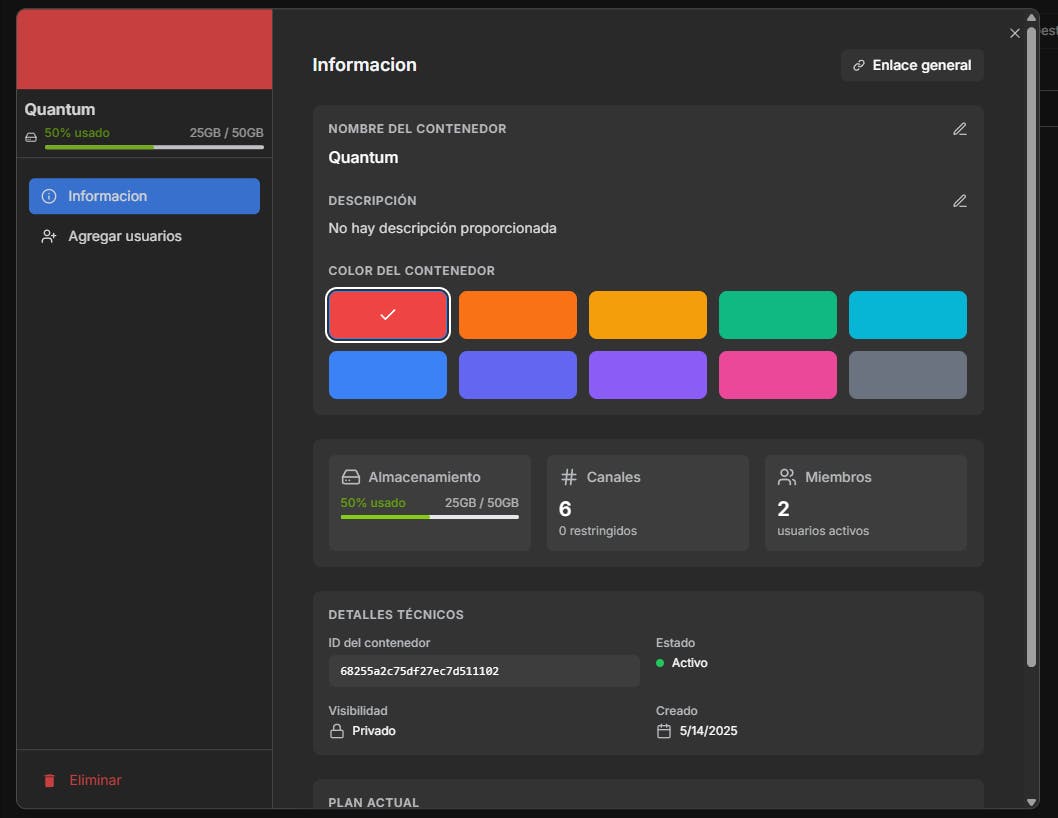
We want to share an update on a highly requested improvement we’ve been working on: the new container configuration interface.
What was the issue before?
Settings were scattered across menus, pop-ups, and sometimes buried three clicks deep.
It wasn’t clear how to edit, add members, or view technical details.
What’s changing? (Work in progress)
One centralized place for everything: Quick access, no more maze-like navigation.
Clear design: Intuitive for everyone—no manuals needed.
Transparency: Technical data (like ID or status) will be visible, not hidden.
"This is progress in action. We want you to see how your feedback turns into real improvements."
What’s next?
We’ll keep refining details (and sharing updates).
If you have ideas or feedback, we’re here to listen.
Replies
The old flow definitely felt like a hunter hunt so happy to hear everything is getting centralized.
@steven_granata Thanks, hahaha yeah improving every day
TrackerJam
Introducing a clearer more intuitive interface for a smoother user experience. Cleaner layouts, better navigation, and faster access to what matters. Designed to help you focus, not fumble.
@maklyen_may Thanks, of course