


We tested Datastripes in creating a complete dashboard in 30s
If you follow our journey in Datastripes, you know our approach: experimenting, experimenting, experimenting. Thus, we ran a simple experiment, 5 days from the launch:
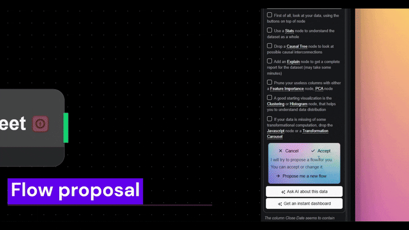
We uploaded a messy CSV about CRM stages.
We let the AI decide the best way to clean, transform, and visualize it.
We timed the process from raw data to an interactive dashboard.
Result: 30 seconds. ⏱
But wait… someone asked us: how does this compare to GPT-5 or Gemini?
We love GPT-5 and other general-purpose LLMs, we use them a lot and they’re amazing for text, and even some quick chart generation (with the canvas mode). But when it comes to end-to-end data analysis at speed, we found a big difference:
Here is a comparison of key features:
Feature: Conversational data queries
GPT-5: ✅
Datastripes: ✅
Feature: Different data sources (DB, ERPs, files)
GPT-5: ❌
Datastripes: ✅
Feature: Suggest full analysis workflows
GPT-5: ⚠️ Limited
Datastripes: ✅ Automatic
Feature: Interactive dashboard hosting
GPT-5: ❌
Datastripes: ✅ Instant
Feature: Shareable links for the team
GPT-5: ❌
Datastripes: ✅ 1-click
Feature: Infrastructure for data pipelines
GPT-5: ❌
Datastripes: ✅ Built-in
So, why Datastripes feels different
Datastripes was built for data, not just as an add-on to an LLM.
From the moment you upload, it knows how to:
Propose a complete analysis flow
Host and share the dashboard instantly
Keep all transformations transparent (node-by-node)
You still get a natural language interface like GPT-5, but with the specialized muscle of a platform designed for real-world data handling and collaboration.
📊 Try it yourself in 5 days: see if your dataset can go from zero to dashboard in 30 seconds.
We are launching on August 13th here: https://www.producthunt.com/products/datastripes?launch=datastripes
But you can see also a demo right now on: https://datastripes.com
Replies
Clear and insightful analysis. Vibechart excels at instant query-to-chart, but Datastripes plays in a different league: automated ETL+viz pipeline generation, data cleaning, aggregations, and insights in a coherent, transparent flow. I’ve tested it, and the ability to go from raw dataset to interactive dashboard in seconds is truly impressive