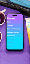
Clear 2 is redesigned and remade from the ground up, featuring features and gestures, a vibrantly colorful design for its collectible themes, and a deep dive into personalization, including customizable gestures.
Clear launched in 2012 and delighted with its delightfully simple and gesture-fluent take on listing. v2 is:
• Even more gesture fluent
• Even more colorfully personalizable
• Even more rewarding to use
• And somehow even simpler.
• Oh and it’s free now too!
@chrismessina Looks clean as it always has been. Not sure what really needs to change with an app thats meant to be simple, is there a killer new feature for you? Will definitely give it a shot again. Rest of thoughts: https://youtu.be/Q2jdJLWAZrs
Wow this is kind of an unbelievably positive response! I wish I had been able to catch you all earlier but had some launch fires to deal with 😅
The new Clear is a real indie labor of love, and swing at the fences. We hope it's able to find some footing in today's very difficult App Store world and prove there's still a place for pure app experiences like this.
It sounds like for many of you this brought you back to 2012 and simpler days in the App Store. We believe simple timeless beauty still has a place in today's world. This one's for you if you think the average productivity app is too complicated. Thank you for supporting it.
fascinatingly designed. it's a delight for anyone who wants a to-do app without the riff-raff. the sounds, icons, colours and UI keep me thoroughly engaged and striking tasks off with immense joy. kudos to the awesomely creative minds that made this app a possibility. look forward to clear 2.0 beyond the beta.
Congrats on the progress! I really like this app, the UI is really clean, but I would really love to see the todos being persisted with a web version so I can manage the todos of my pc and phone as well (which is my main place of work).


Paper Billionaires
Clear 2
Fluency