Paper Run

Paper Run

The ultimate tech & science news mashup

2 followers

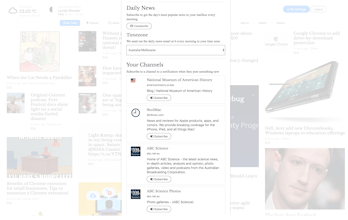
Paper Run is a Tech and Science news aggregator that get the latest news from over 200 sources every 5 minutes. You can create your own feed based on the sites you like, bookmark articles so you can come back to them later or filter the news by topic. You also have the option to get the news sent directly to your mailbox if you wish.
Paper Run gallery image
Launch tags:
NewsTech
Launch Team

What do you think? …

Ryan Hoover
Very Flipboard or Pinterest-like. How are you sourcing and ranking each post, @vimbabwe? Truthfully, for me it feels overwhelming as my eye darts across the page. I can see how others might like this presentation though.
vimbabwe
@rrhoover thanks for the feedback. I have a list of domains that the site visits every 5 minutes to check if they have any new news, I'm constantly adding sites to that list, so if anybody knows any high quality but not so well known sites (especially science ones), please let me know. As for ranking, the algorithm is like the reddit one, its based on when the news came out and how many people have given it a heart.
Pedro J. Martínez
@vimbabwe I'm with @rrhoover on this. Looks pretty cool but it's a bit overwhelming. I think more consistent size between news (some are very small, and I got the point, it's the way you highlight the most featured ones but the sizes look odd to my eyes), better block distribution and tweaking the margin would help.
vimbabwe
@inthe0n thanks for the feedback, appreciate it.
vimbabwe
@rrhoover @inthe0n @praveenpoojary1 @just2jays Thanks for the feedback. Based on what you said, i have made an new layout for anyone who wants a more compact view. On the site (on desktop) click on the link that says "compact" on the left hand side of the nav. You can always toggle back to the "in your face" layout whenever you feel like it.
Pedro J. Martínez
@rrhoover @praveenpoojary1 @just2jays @vimbabwe Much better! I knew you deliberately made this full-width layout, checking out your portfolio is enough to realize you're a good designer. That's why I get your point with the full-width layout but I really like the compact one. Just one more suggestion: save the chosen layout on localStorage so users don't have to change it every time:)
vimbabwe
@inthe0n cheers, glad you like it, btw if you are signed in, it automatically saves your preferred settings for layout and temperature units
JJ
This is really cool! Feels like information overload on desktop but I actually prefer that sometimes. Is there a way to switch from Celsius > Fahrenheit in the left corner? (I feel like a double-click of the temperature would be a nice toggle.)
vimbabwe
@just2jays Thanks for the feedback, i knew i would get a lot of comments about the visual overload aspect of it, but after experimenting for a while with different layouts, this gave it that extra cool factor. It's the differentiator, some people will like it, many will absolutely hate it. It has an element of randomness built into it which i like too, i feel like i'm always discovering stuff, i look at articles i would have never looked at. For example if you load the site, then reload, the layout for the articles changes randomly some of the ones with small images now have larger ones drawing you eye to them, and vice versa. About the toggle, thank you for this 👏 , it's one of those things i didn't think about but am definitely going to implement, look out for it in a couple days.