

Unite These Fuckers
Compare Conservative/Liberal articles on the same topics
2 followers
Compare Conservative/Liberal articles on the same topics
2 followers
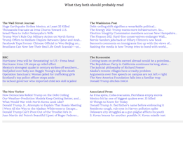
This is a tool where you can get news from both Liberal and Conservative sources for the same topics


Virtual Learning Resources for Kids
Virtual Learning Resources for Kids
Love it!
Pros:Absolutely hilarious. Good source of info.
Cons:Missing a few conservative sources (NY Post, Washington Times).
Spotted a couple of typos here and there (Washinton Post).