I built this because I wanted a React component library that feels modern, flexible, and truly developer-first, something that’s open-source, easy to customize, and designed with accessibility and AI-readiness baked right in.
What’s new and unique about ScrollX UI?
It’s built with a clean composable pattern (Root / Trigger / Content) that keeps components consistent and easy to extend.
Unlike many libraries, every piece is fully open-source, so you can adapt it exactly how your project needs.
We’ve integrated AI-friendly structure to help developers scaffold, refactor, and maintain UI faster than ever.
It comes with beautiful defaults and seamless Tailwind CSS integration for quick styling.
What I’m most proud of is how ScrollX UI balances simplicity and power. it helps developers ship polished, accessible apps quickly without sacrificing flexibility or design quality.
New Domain: ScrollX UI has officially moved to scrollxui.dev faster access, cleaner experience, and easier to explore.
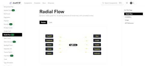
4 Brand-New Components: We ve added 4 new customizable components to make building dynamic UIs even smoother.
Why It Matters: These additions help developers create engaging interfaces with less effort , while keeping everything fully responsive and performant.
Thank you for your feedback. We plan to add table components in the future. In the meantime, you can explore our latest components, which are marked with a New tag.