Radix UI

Radix UI

Open-source UI components for building accessible web apps

5.0
‱29 reviews‱

763 followers

A suite of open-source projects for building high-quality, accessible web apps and design systems.

This is the 4th launch from Radix UI. View more

Radix Themes

A beautiful component library for building React apps faster
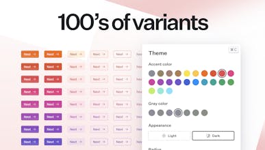
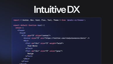
Radix Themes is an open source component library for building modern web apps. It helps you build faster and makes it easy to create beautiful, accessible interfaces that are a breeze to maintain.
Radix Themes gallery image
Free
Launch tags:
Open Source‱Developer Tools‱GitHub
Launch Team

What do you think? 


Vlad Moroz
Maker
📌
Hi everyone 👋 This is Vlad—designer and engineer at @workos, and Radix Themes maker. Radix Themes is an open source component library for building modern React app: https://www.radix-ui.com It helps you build faster and makes it easy to create beautiful, accessible interfaces that are a breeze to maintain. Companies like Vercel, CodeSandbox, and Supabase, among others, already build their interfaces on top of Radix. We hope that it’s going to be easy to build yours too. Instead of re-inventing common designs and working on the components over and over, we made Radix Themes to help you focus on your product and build faster. Under the hood, Radix Themes is built with TypeScript, React and vanilla CSS. All design tokens are CSS variables that—if needed—you can tweak, overwrite, or use to build your own components with any styling solution you like. This also means that you can inject your own brand colors, set custom fonts, tweak the space scale, or use the provided tokens in your custom components, creating a coherent look and feel. The idea to build Radix Themes came while working on our own design system at WorkOS, which is so loved by our engineers and designers alike. Through the experience of maintaining our own dashboard and docs apps, we discovered hundreds of incredible design details and edge cases that we wanted our design system to take care of. Like with Radix Primitives, we also were obsessed with getting the developer experience right. For every component we asked ourselves—what is the right API? What are the right props and parts? What should, and more importantly, shouldn’t be a part of this component? What API would make the code easy to understand and maintain, and what would put you into a messy situation that could bite when you don’t expect it? As we built out our own design system at WorkOS, everyone on the team felt like we were onto something—so we used our own, battle-tested component library that serves thousands of users to kickstart Radix Themes. We hope that you find Radix Themes useful. That’s 45 components, hundreds of carefully crafted variants, a handful of simple, yet powerful primitives for layout, and an extensive token system—all yours. Would love to get your feedback, questions, and ideas. I'm so excited to see what you all build :)
Eddie Forson
Congrats on the launch Vlad! Radix Themes looks great. I wish it was already present when I started working on EnVsion :(. I'm tempted to give it a go for my next side project :). There are quite a few component libraries these days. What differentiates you from Chakra UI for instance?
Vlad Moroz
Thank you, Eddie! Let us know how it goes if you decide to try out Radix Themes for your side project. Here’s what differentiates Radix Themes from other component libraries: We hope that Radix Themes stands out with a considered, sensible, consistent developer API and world-class visual design. Beyond that, Radix Themes doesn’t suggest a particular styling solution and doesn’t rely on JavaScript libraries like emotion for styling. You can use Radix Themes with other CSS tech with no extra overhead coming from us on that side. Radix Themes also aims to strike the right balance between feeling flexible and feeling rigid where it counts. All functionality from Radix Primitives is there. However, you may notice that we are quite conservative with the styling options exposed on the components—there’s no `sx` or `css` prop. Beyond simple overrides and configuration, we rather encourage using the components and their variants as is; custom components and your unique versions can be created with the token system that we provide. We believe that over time, this will guide our users towards the right choices, building the UIs that are a joy to maintain.
Moritz Tomasi
This is really nice! Definitely going to use this for my upcoming project, which is going to use Radix UI. Congrats on the launch and good luck! We've also launched our product today (https://www.producthunt.com/post...) and as of writing of this comment we're ranking neighbours 😁 Also, your landing page is really cool!

Do you use Radix UI?

© 2025 Product Hunt