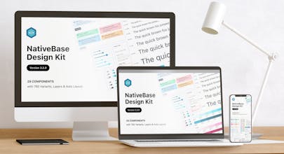
A Figma design kit that emulates all of the utility props from NativeBase. Seamlessly integrate style guides, UI components, and pages into your web and mobile apps.
Hey Makers, thanks for looking at NativeBase v3 Design Kit!
The problem that we're trying to solve:
We want to bridge the gap between designers and developers for a more productive, inclusive, and consistent workflow together. We aim to achieve both visual and functional consistency.
The solution:
NativeBase v3 design kit is a Figma file that mimics all utility props from NativeBase. Every bit of spacing, typography, shadow, anything you can imagine can be perfectly recreated using the default utility props from NativeBase.
Who is this for?
1. If you're a designer, you can use this kit for personal projects or building apps for your clients.
2. If you're a developer, You can concentrate on other essential things such as markup, coding, SEO, etc.
Download it at:
https://www.figma.com/community/...
Features:
💅 Extensive styles for typography and color.
🪄 Dynamic layers powered by Auto Layout.
🎨 Highly themeable components
🖥📲 Responsive designs for different platforms.
🌓 Available in light and dark mode.
Go ahead and check it out! AMA.


gluestack