This is the 5th launch from HeadPhoneCharts. View more
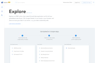
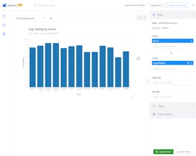
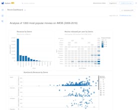
Explore by Charts.com
Free chart maker & visual exploration for spreadsheet data
This tool takes in your spreadsheet data (CSV, Google Sheets, Excel in Dropbox etc.) and helps you create charts, visually explore data, create dashboards, sync them with live data, and export PDFs. On the data side, it allows you to create segments, conditional and calculated fields and more.
Hi everyone,
I’m Pallav from Charts.com. We’ve made this free tool to help business users and analysts alike, who need to “analyze” their data in spreadsheets, and not just “visualize” as charts. And, further to share the analysis with others (without exposing underlying spreadsheet); or consume and act on data themselves.
What this tools enables is:
- Quick visual exploration of data (spreadsheets), in-browser without installing anything
- Enabling business operations on data (automatic/intelligent date-time grouping, segments, calculated/conditional fields) typically required during analysis, without needing deep expertise in spreadsheets.
- Less “form-driven”, more “visual-driven” exploration (lesser cognitive load, and more lazy exploration). Be it drill-downs from chart point to grid to see filtered underlying data, perform sum/avg on specific or multiple points on chart through selection, see co-relation between between different measures on chart through interactions etc. (Though some items right now, like filters, are still form-driven and we’re exploring what can be done better!)
- Easier self-consumption of data without having to open multiple spreadsheets. Viewing live data from different spreadsheets in a consolidated place (single dashboard), without having to open all of them. And automatic refresh of data.
- Collaboration with others by sharing charts, dashboards (along with narratives) with others else in team (chart/story with narrative), without the need to share underlying spreadsheets.
We’ll building towards speed and efficiency of getting insights from spreadsheet data, very quickly and easily.
Would love to get your feedback.
@hans_dekker Currently (for this quarter), our approach is to stick to spreadsheet data. The reason being: there are enough tools to help you get your data into Excel/Google sheets and do joins there, post which you can feed that sheet into Explore. We're working on building connectors to cloud databases, but that's for next quarter. As of now, we do not intend to build connectors (yet!) to SaaS apps (again same reason, you have tools which can bring such data into a Google Sheet, which you can then feed to Explore). Hope this works for you.
As for many similar products the only question was: is it better than MS Office solutions? Based on the sample dashboard I can say that in one important thing it is better than both Excel and PowerPoint: when you tap on the data point on the chart, the tool shows you all information about this element. It is very useful for people who work with a huge amount of data. So, because of this feature, I can give an upvote
Maybe I didn't use enough the tool, but I didn't find any other important features. It is very limited in comparison with excel in data analyzing and with PowerPoint in data visualization. And I also couldn't upload my personal file to this tool :(
@vasilii_ushakov Thanks for your feedback.
We’re not building a Office replacement - but rather something that can be used in conjunction with your spreadsheet. The goal is help users quickly analyze, through visual exploration, of data contained in spreadsheet. Some of the things that you can do in Explore more easily are:
- Do quick date-time aggregations/operations on data and visualize
- Do quick aggregations on data (sum/avg/min/max etc.) in one click, through visualizations
- Go from chart to data-grid quickly (visual filtering), and/or add manual filters
- Create ‘virtual’ segments of data and run the same created chart across those segments to analyze
- Enable multi-faceted charts (cross tab), heat maps etc for visualization
- Allow you to start with data, and keep exploring what visual works best for analysis
- Compare 2 dimensions (Date vs Date, Category vs Category) with a measure
- Automatically binning for histograms
- Bring data from multiple spreadsheets (across G-Sheets, Excel, Dropbox) add add to single dashboard; to monitor your metrics and refresh them in one-click. This saves you effort to open each spreadsheet, and easier to share.
- And more things, which are relevant again to analysis of your spreadsheet data.
Sorry to hear your data couldn’t be loaded - can you pls send me to at pallav [at] charts.com
HeadPhoneCharts
Lyne
HeadPhoneCharts
HeadPhoneCharts
GraphicOne App
HeadPhoneCharts
HeadPhoneCharts