
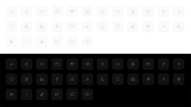
Calm - IOS14 Icon Set
UX on home screens is broken. Calm lowers screen fatigue
0 followers
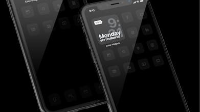
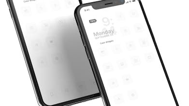
IPhone home screen UX is broken. Calm Icon Set was designed to use the IOS14 Shortcuts icon hack to remove visual clutter on your iPhone and lower screen fatigue and screen time through UX/UI. My screen time use decreased by 38% so far.


Launch Team


Darjan Hren
Maker
The iPhone home screen and App menus have been a problem for me for a long time now. As I designer, the icons never had consistency, the notification bubbles with its high numbers were bothering me, it was busy and it didn't really feel great to use it.
As IOS14 allows to make shortcuts to these app icons with custom icons, which is great!
With that option now available, I've been designing a new UX/UI with the goal of lowering screen time and information fatigue, remove clutter and distractions,... In one word, I want to keep my screen and my mind Calm.
So I removed everything I could and minimised the information, icons, colors and even removed the text under the icons.
To be honest, the last week of using it, my Screen time lowered by 38% and that is including the time I tested the designed icons.
There are also no notification bubbles anywhere now. I look at missing calls or messages through notifications but turned off most of the others. Next step is to try and turn those as well and just look at the phone couple of times a day.
Widgets are also great and more will come, but do we really need them? I only use one for the date + time (Color Widgets).
I also limited myself to only using one screen and moving all app icons to the library. It's great and the motivation has been lowered to play mindlessly with these as now I need to search them.
It really feels like one of those phones from 20 years ago and I love it. It's like a phone detox I never knew I needed.
Report
Share